
Why Nobody Scans Your QR Code to Follow You or Leave a Review (And How to Fix It)
You printed the QR code. You stuck it on the counter. You waited.
Nothing happened.
Maybe one person scanned it. Your mom, probably. The rest of your customers walked right past it like it wasn’t there. Which, psychologically speaking, it wasn’t.
QR codes can be incredibly effective for growing followers and collecting reviews. Scan rates of 15-20% are achievable. But most businesses see rates closer to 1-2%. The difference isn’t luck. It’s execution.
This guide covers why your QR codes are being ignored and the specific fixes that can double or triple your scan rates.
The Invisible QR Code Problem
Walk into any local business and you’ll spot QR codes. On the counter. On a wall poster. On a table tent buried behind the napkin holder.
Now ask yourself: when was the last time you scanned one of those?
QR codes fail for three reasons: bad placement, bad design, or bad context. Usually all three. Each problem has a fix, but you need to diagnose which ones apply to your situation.
Placement Mistakes (And Fixes)
Mistake: Putting the QR code where people are busy
The register is a popular spot. It’s also a terrible one.
Think about what customers are doing at the register. Finding their wallet. Entering a PIN. Grabbing their receipt. Answering “do you want a bag?” They’re in transaction mode, focused on completing a task. A QR code asking them to do something extra gets filtered out.
The fix: Place QR codes where people have idle time.
At a restaurant, that’s the table while waiting for food. At a salon, it’s the chair during processing time. At a coffee shop, it’s the pickup area while waiting for their drink. At retail, it’s the fitting room or the line if there is one.
The question isn’t “where do customers go?” It’s “where do customers wait?”
Mistake: Placing the code where it’s physically awkward to scan
A QR code on the wall behind the counter requires customers to hold up their phone in a weird way, visibly pointing it at your business. Some people find this awkward. They won’t do it.
Similarly, codes placed too low (below waist height) or too high (requiring looking up) create friction. Scanning should be effortless.
Fix: Position codes at natural phone height, within arm’s reach, at angles that don’t require conspicuous behavior.
Table-level works. Counter-level works. Eye-level on a stand works. Behind the register on a high wall doesn’t.
Mistake: Only having one QR code
One code means one chance. If someone misses it or isn’t in the mood at that moment, opportunity gone.
Better approach: Multiple placements, multiple opportunities.
A review QR code at the table AND on the receipt. A follow us QR code at the counter AND on packaging they take home. Each touchpoint is another chance to convert.
This doesn’t mean plastering codes everywhere. It means strategic placement at different points in the customer journey.
Design Mistakes (And Fixes)
Mistake: Generic black-and-white code with no context
A naked QR code communicates nothing. It’s a square of squiggles. Why should anyone scan it? What happens when they do? Mystery doesn’t create curiosity here. It creates indifference.
Fix: Always include a clear call-to-action.
“Scan to follow us on Instagram” tells people what they’re getting. “Leave us a quick review” sets expectations. “Get 10% off your next visit” provides incentive.
The text around your QR code matters more than the code itself.
Mistake: Code is too small to scan easily
Phone cameras are good, but they’re not magic. A tiny QR code on a business card requires precise positioning to scan. Most people won’t bother with that precision.
Fix: Minimum 2cm x 2cm for close-range scanning (table tents, receipts). 4cm x 4cm or larger for anything meant to be scanned from a distance.
When in doubt, bigger is better. Nobody ever complained that a QR code was too easy to scan.
Mistake: Low contrast or busy background
QR codes work through contrast. Black on white is ideal. Dark gray on light gray might not scan reliably. Code printed over a photo or pattern? Good luck.
Fix: High contrast, clean background, adequate white space around the code.
If your brand colors don’t provide enough contrast, use a white background box around the code. Functionality beats aesthetics here.
Mistake: The code looks like every other code
This is subtle but real. When every business has the same generic QR code, they all blur together. Visual sameness creates invisibility.
Fix: Customize the code to match your brand.
Many QR generators let you add colors, rounded corners, or even a small logo in the center. These customizations make your code visually distinct without breaking scannability. Both SocialCounters QR generators offer this.

Context Mistakes (And Fixes)
Mistake: Asking for the scan at the wrong moment
Timing matters enormously. Asking for a review before someone has finished their experience is premature. They haven’t formed an opinion yet. Asking for a follow when someone is annoyed (long wait, problem with order) is tone-deaf.
What works: Match the ask to the emotional moment.
Ask for reviews after positive experiences. The compliment they just gave you. The smile when they see their food. The “that was great” as they’re leaving. That’s when people are primed to share.
Ask for follows during curiosity moments. When they’re looking at your menu. When they see something interesting on your wall. When they have idle time and their phone is already out.
Mistake: No reason to scan
“Follow us on Instagram” is a request, not a value proposition. Why should they follow you? What’s in it for them?
Solution: Give people a reason.
“Follow us for daily specials” gives them value. “We post new menu items there first” creates FOMO. “See behind-the-scenes content” offers something exclusive.
For reviews: “Your feedback helps us improve” works for some people. “Help other customers find us” appeals to the helpful. Sometimes honesty is best: “Reviews really help small businesses like ours.”
Mistake: The QR code leads somewhere disappointing
Someone scans your code expecting… something. If it leads to a generic homepage, a broken link, or a page that takes forever to load, you’ve burned the interaction. They won’t scan your codes again.
Fix: QR codes should lead to exactly what they promise, with zero friction.
A review QR code should open directly on the Google review page, keyboard ready. Not your Google Business listing where they have to find the review button. Not a page asking them to choose a platform. Direct to action.
A follow QR code should open the Instagram app (if installed) directly on your profile with the follow button visible. One tap to complete the action.
Purpose-built QR generators exist for exactly this reason. A Google Review QR code generator creates codes that link directly to the review interface. A generic QR code pointing to your Google listing adds an extra step that kills conversions.
The Amplification Trick: Combine QR Codes with Live Displays
QR codes work better when paired with social proof.
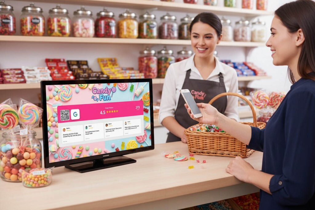
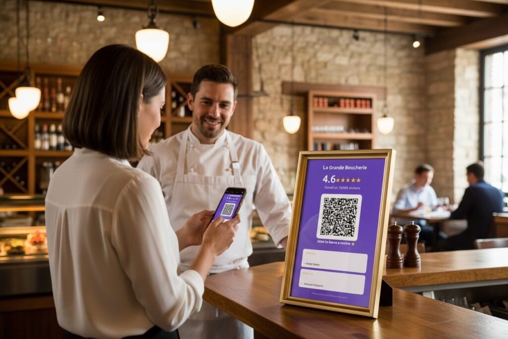
A code that says “Follow us on Instagram” next to a live counter showing 2,847 followers creates a different psychological response than the code alone. The number validates the ask. “Other people have done this. Maybe I should too.”
Same with reviews. A Google rating display showing “4.7 ★ from 284 reviews” next to a review QR code answers the implicit question: “Do other people actually review this place?” Yes. Hundreds of them.
The display provides the why. The QR code provides the how. Together they convert better than either alone.
Testing What Works
You won’t know what works for your specific business without testing.
Week 1: Put a review QR code at the register. Track scans and reviews.
Week 2: Move it to tables or the waiting area. Compare.
Week 3: Change the call-to-action text. Compare again.
Week 4: Add a second code somewhere else. Measure total lift.
Small changes can double scan rates. But you have to actually measure. “It feels like more people are scanning” isn’t data.
Most QR generators show scan statistics. Use them. The numbers tell you where attention actually goes versus where you assumed it would.
A Quick Placement Cheat Sheet
| Business Type | Best Review QR Placement | Best Follow QR Placement |
|---|---|---|
| Restaurant | On table, on receipt | Menu, waiting area |
| Coffee Shop | Pickup counter, cup sleeve | Pickup counter, near display |
| Salon/Barbershop | Mirror station, checkout | Chair, product display |
| Retail | Fitting room, bag/packaging | Near entrance, checkout |
| Gym | Locker room, equipment area | Check-in desk, class schedule |
These aren’t rules. They’re starting points. Your customers might behave differently.
The Minimum Viable QR Strategy
If you implement nothing else:
One review QR code in a location where customers have idle time and have completed their experience. Not the register. Generate it free here.
One follow QR code in a location where customers can see it while waiting, with a clear reason to follow. Generate it free here.
Clear calls-to-action on both. Not just the code. Words explaining what it does and why they should bother.
That’s it. Three elements. Takes thirty minutes to set up. Costs nothing.
The businesses getting 15-20% scan rates aren’t doing anything magical. They’re placing codes where people actually look, making them easy to scan, and giving people a reason to bother.
Your QR codes can work. They just need a chance to be seen.